Separate Mobile (m.) and Desktop Web Sites


Figure 1: Separate mobile (m.southwest.com) and desktop (southwest.com) web sites.
Web site:
http://www.iicm.tugraz.at/keith/
Slides:
http://keithandrews.com/talks/2013/maribor2013/
Thu 05 Dec 2013, University of Maribor, Slovenia.
http://mattandrews.info/talks/port80-2013/
http://responsivenews.co.uk/post/18948466399/cutting-the-mustard
Figure 1: Separate mobile (m.southwest.com) and desktop (southwest.com) web sites.
A single web site design which dynamically responds (adapts) to the characteristics (screen width, resolution, capabilities) of the display device.
Responsive web design is a combination of:
Responsive web design allows a single web site to adapt to a variety of display sizes and devices.
Lists of responsive web sites:
mediaqueri.es
http://designmodo.com/responsive-design-examples/
Individual examples of responsive web sites:
bostonglobe.com
http://bbc.co.uk/bbcone/
http://channel4.com/news/
http://theguardian.com/uk?view=mobile
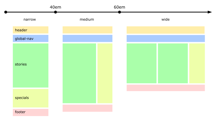
Figure 2: A typical breakpoint diagram.
/* settings for window-width: narrow */
@media only all and (max-width: 40em) {
...
}

/* settings for window-width: medium */
@media only all and (min-width: 40em) and (max-width: 60em) {
...
}

/* settings for window-width: wide */
@media only all and (min-width: 60em) {
...
}
Design a fluid (liquid) layout for each of the widths in the breakpoint diagram:
http://www.maxdesign.com.au/articles/css-layouts/
or Google search for
"CSS liquid two-column layouts" or
"CSS liquid three-column layouts".
divs next to each other for columns
(clearfix issue).
display: inline-block to place divs
next to each other for columns
(whitespace issue).
Provide internel structure to chunks of textual content:
<article>
<h1>Title<h1>

<div class="teaser">
<p>Some teaser text...</p>
</div>

<div class="summary">
<p>A concise one-paragraph summary of the story.</p>
</div>

<div class="story">
<p>The full story.</p>
<p>In multiple paragraphs.</p>
<p>Maybe with images.</p>
</div>

</article>
http://www.frankieroberto.com/responsive_text
http://mobile.smashingmagazine.com/2012/02/27/ever-justification-for-responsive-text/
width: 60ex;) for wide displays.
column-count).
line-height, letter-spacing,
word-spacing).
http://jsbin.com/apane6/14
http://filamentgroup.com/examples/rwd-table-patterns/
http://css-tricks.com/examples/ResponsiveTables/responsive.php
http://mobifreaks.com/user-interface/responsive-and-seo-friendly-data-tables/
http://view.jquerymobile.com/1.3.1/dist/demos/examples/tables/movie-list.html
http://dbushell.com/2012/01/05/responsive-tables-2/
http://codepen.io/JasonAGross/full/rjmyx
http://zurb.com/playground/responsive-tables
http://libcodes.com/codes/css3-rainbow-responsive-price-tables
http://bradczerniak.com/responsivetables/
http://designshack.net/articles/css/focal-point-intelligent-cropping-of-responsive-images/http://zomigi.com/blog/hiding-and-revealing-portions-of-images/
http://iipimage.sourceforge.net/2012/08/responsive-images-using-iipimage/
http://www.iandevlin.com/blog/2013/10/responsive-web-design/resimagecrop-a-responsive-image-solution
picture element --> RespImg Syntax proposal (src-n)
http://tabatkins.github.io/specs/respimg/Overview.html
<img alt="Photo of Keith."
  src-1="(max-width: 300px) keith-s.jpg"
  src-2="(max-width: 600px) keith-m.jpg"
  src="keith-l.jpg" />
@media screen and (min-resolution: 300dpi) {...}
http://blog.cloudfour.com/media-queries-in-svg-images/
demo1
demo2
http://coding.smashingmagazine.com/2012/02/13/progressive-and-responsive-navigation/http://www.hongkiat.com/blog/responsive-web-nav/
http://coding.smashingmagazine.com/2013/01/15/off-canvas-navigation-for-responsive-website/
@media all and (orientation: landscape) {...}
http://www.onextrapixel.com/2012/06/13/really-useful-resources-and-tools-for-responsive-web-design/
http://bdconf.com/
Videos available on Vimeo channel
http://vimeo.com/bdconf
http://fronteers.nl/congres/2013
Videos available on Vimeo channel:
http://vimeo.com/fronteers
http://webdirections.org/
Videos available:
http://webdirections.org/videos/
http://mobilism.nl/
Videos available:
http://mobilism.nl/2013/coverage
http://aneventapart.com/
Videos available:
http://aneventapart.com/news/tag/video
http://vimeo.com/45915667,
slides
http://www.slideshare.net/stephenhay/mobilism2012.
http://vimeo.com/64144191,
slides
https://speakerdeck.com/grigs/mobile-first-responsive-design-bdconf-orlando-april-2013.
Prof. Keith Andrews
IICM, Graz University of Technology, Austria
Web site:
http://www.iicm.tugraz.at/keith/